Most affiliate marketers think traffic is the problem.
But sometimes, traffic isn’t the issue at all.
That’s exactly what I discovered while running a small Facebook Ads test to my homepage.
The Situation
Over a few days, my campaign was showing healthy signs:
- Click-through rate (CTR): stable
- Cost per click (CPC): consistent
- Landing page views: increasing
On the surface, everything looked fine.
But one metric told a different story.
The Problem I Almost Missed
Even as traffic increased, my affiliate clicks stayed flat.
That meant:
More people were arriving… but not taking action.
Here’s what the pattern looked like:
- Day 1: Traffic up → conversions stable
- Day 2: Traffic up → conversions flat
- Day 3: Traffic up → conversions still flat
At that point, it was clear:
👉 This wasn’t a traffic problem
👉 It was a conversion problem
Related Articles in This Experiment
If you’re following this real campaign step-by-step, these articles break down each stage:
- Can You Run Facebook Ads with $5/Day? A Real Affiliate Marketing Case Study
- The First Signal Your Facebook Ads Traffic Is Losing Quality
- The Real Cost of Affiliate Traffic from Facebook Ads (What Most Beginners Miss)
- How to Estimate When Your Facebook Ads Campaign Will Saturate
- Why Facebook Ads Conversions Often Arrive in Bursts (Not Smoothly)
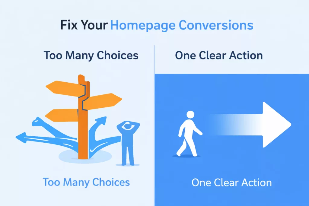
The Root Cause
The issue wasn’t obvious at first.
My homepage was clean, well-structured, and designed to build trust.
But it had one subtle flaw:
It gave visitors too many starting points
At the top of the page, I had a strong call-to-action:
👉 Start My Free Affiliate Journey
But just below it, I had another section labeled:
👉 Start Here
That created a small but important hesitation:
“Which one should I choose?”
Even a moment of doubt can reduce conversions.
The Fix (Simple but Powerful)
Instead of redesigning the whole page, I made two targeted changes:
1. Kept One Clear Primary Action
I kept the main CTA at the top:
👉 Start My Free Affiliate Journey
This became the only “start” action on the page
2. Repositioned Supporting Options
I changed the section below from:
❌ Start Here
To:
👉 New to Affiliate Marketing?
→ Learn the basics first
I also kept a secondary path for planning:
→ Download the free business plan template
This reframed the section as a support system, not a competing decision point.
The Key Principle
This experience reinforced a simple rule:
One page = one clear primary action
Everything else should support that action, not compete with it.
What This Means for You
If you’re running ads (or planning to), check this:
- Does your page have multiple “starting points”?
- Are users being asked to choose too early?
- Is your main CTA visually and mentally dominant?
If not, you may be losing conversions without realizing it.
Final Thought
You don’t always need more traffic.
Sometimes you just need to make the next step obvious.
That’s where real improvements happen.
🚀 Start Here (Free)
Start My Free Affiliate Journey →